



This is the story of how a deliberately simple community website ended up with two colour themes, an automated screenshot test suite, and a fix that applies only to one browser.
As a member of the Repair Café Zug club, I am motivated to use my skills to bring a small improvement to the lives of our community members. As the webmaster for the club's website, I feel the same responsibility when working on the site. It is an item used by our community, and I should make it work for them whenever I can. Even a static site for a small club can be crafted lovingly to work smoothly for the visitor.
The Repair Café Zug website exists for the community. One of its most important goals is to make the Repair Café, and the website itself, available to everyone.
Many of our visitors are elderly and may not be comfortable with technology. Owning an expensive new phone should not give anyone a better experience of the site. Some people use strict privacy settings that turn off JavaScript, and nobody likes clicking through cookie banners.
So the site was hand-crafted with minimal HTML and CSS, and no JavaScript and no cookies. It had a single colour theme, so one pass through the pages was enough to check it, and it was designed to look the same everywhere.
Then I was told that in dark mode, some parts of the site could not be seen.
At the time I had very little experience with light and dark themes on a basic website. I assumed that if I defined only one set of colours, those were the colours the browser would use.
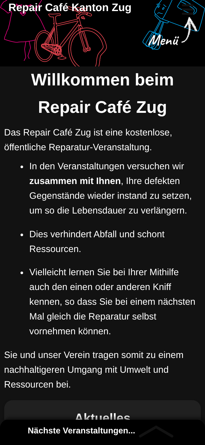
That assumption was wrong. Some people really like dark mode and set their phones and browsers to use it for everything. Some browsers can also force a dark mode onto websites that don't define one. They do this by recolouring the page using their own rules.
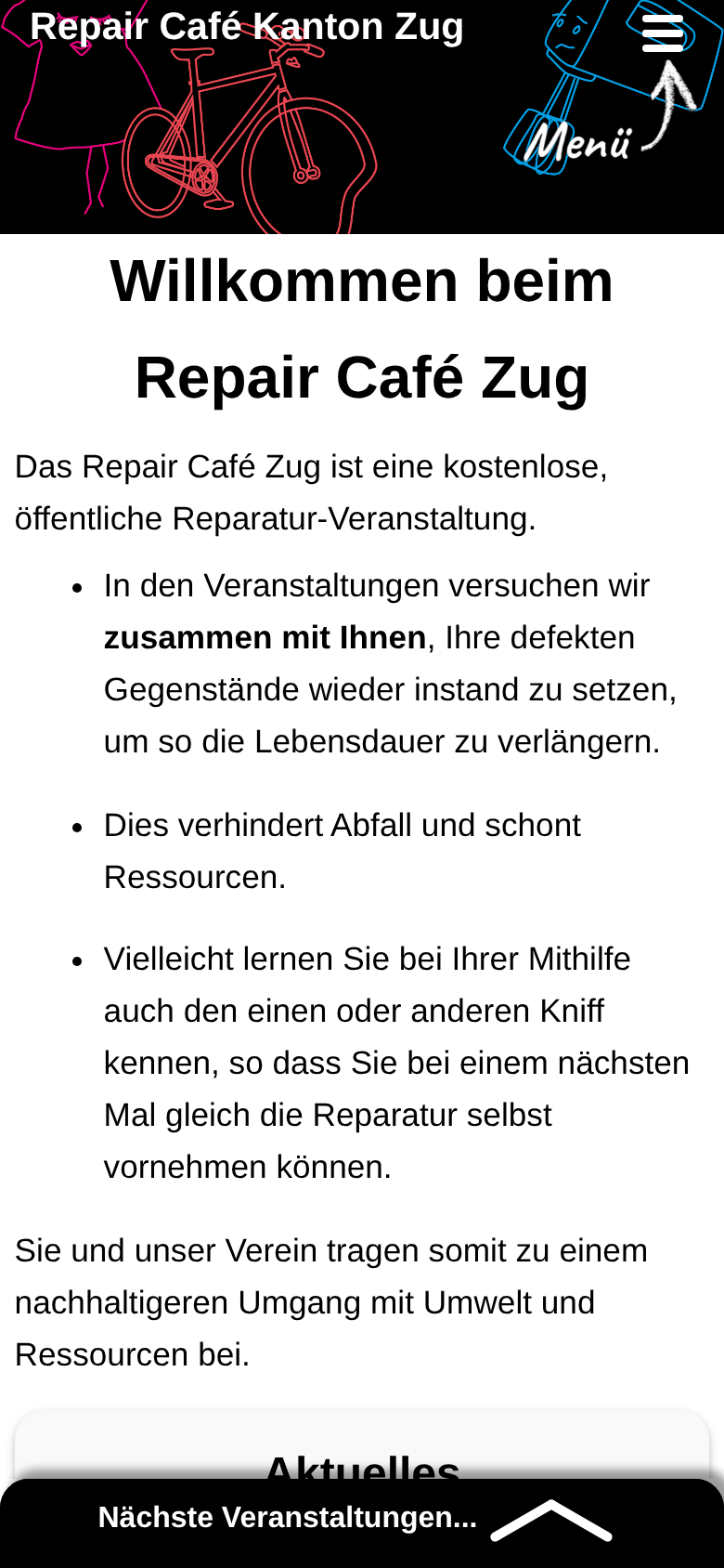
On the Repair Café Zug website, forced dark mode got several things wrong. The two most important controls became barely visible: the menu lines (the “hamburger” icon at the top) and the chevron that opens Nächste Veranstaltungen (upcoming events) at the bottom.
| As designed | Forced dark |
|---|---|
|
|
|
|
|
|
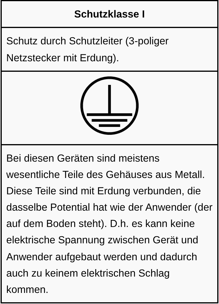
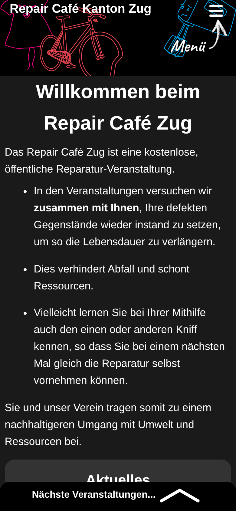
Forced dark also broke images. Several PNG images on the site were carefully drawn as black lines on a transparent background. When the browser turns the page background dark, the black lines fade into it. The Sicherheitsprüfung (safety check) page shows this with the electrical protection class symbols:
| As designed | Forced dark |
|---|---|
 |
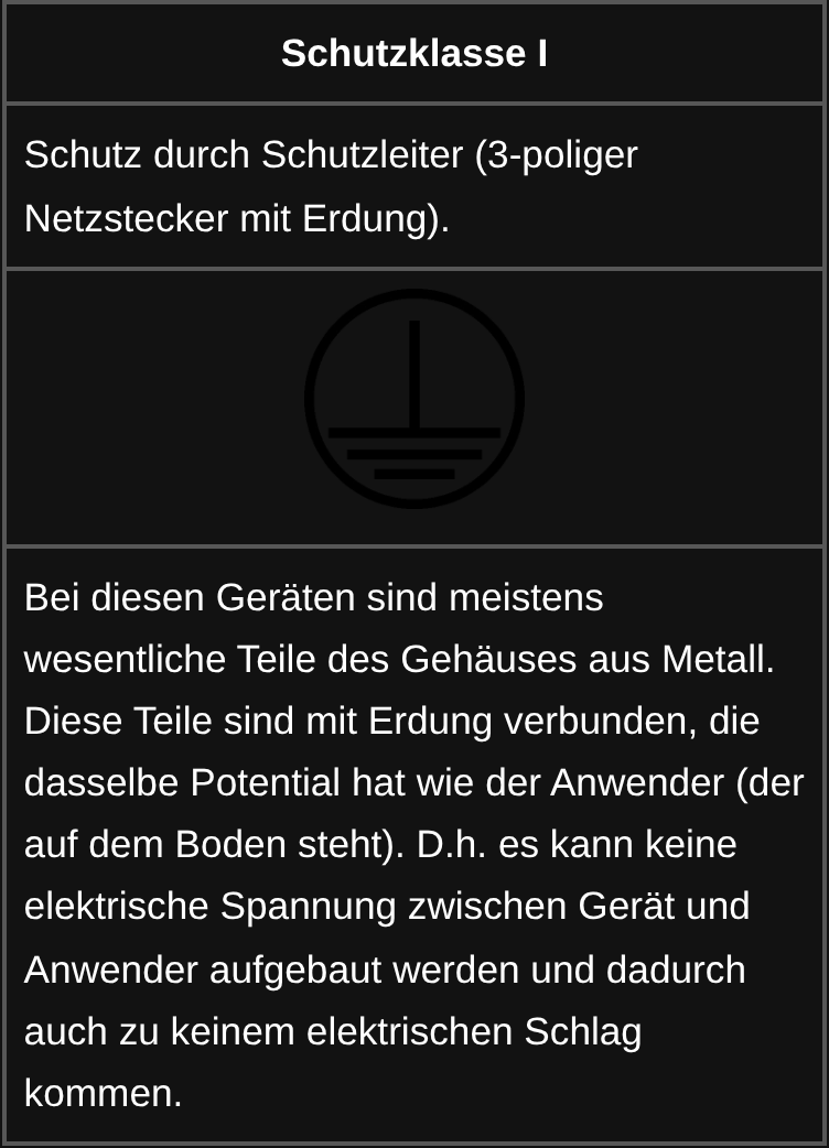 |
The “before” screenshots show the site as it was before any dark mode work. Forced dark is simulated with Chromium's built-in auto-dark mode, which is the engine Samsung Internet is built on.
There seemed to be two options:
color-scheme: only light.
I chose the first option, even though it is more complex and harder to maintain. People who choose dark mode deserve a site that respects that choice instead of ignoring it.
This took some non-trivial work:
prefers-color-scheme: dark block switches them over (in index.css).
image-invert-to-theme) that inverts an image
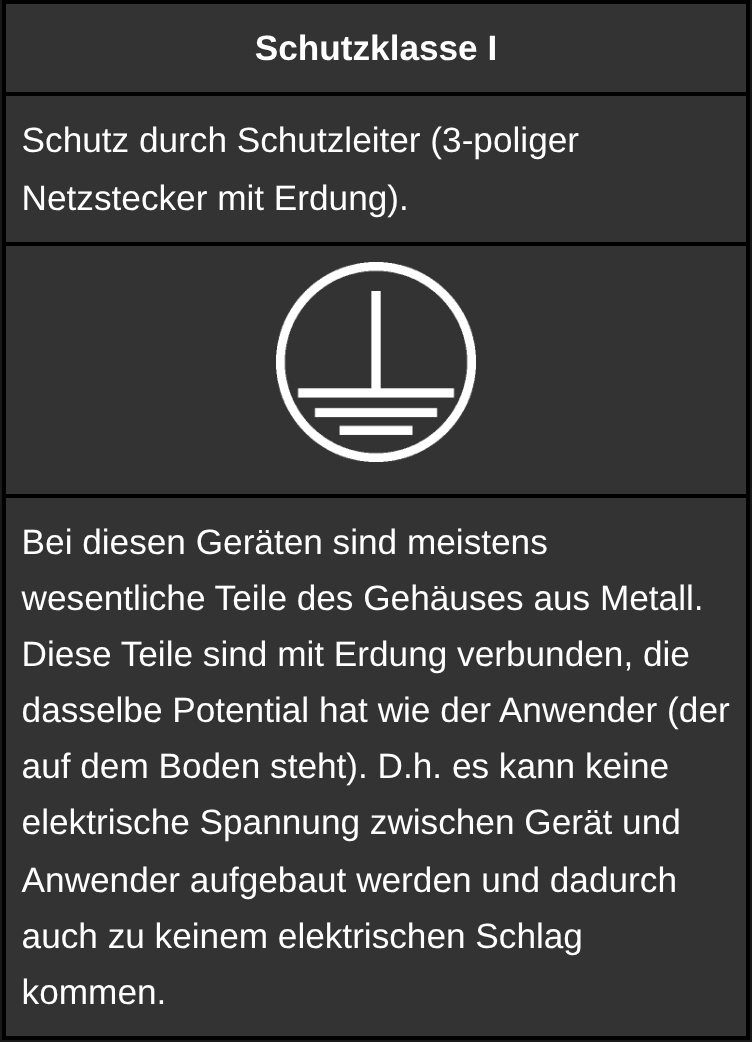
only in dark mode. The same black-on-transparent PNG becomes white-on-transparent.
The screenshot tests confirmed that the new dark mode worked:
| Designed dark mode | Inverted symbol |
|---|---|
 |
 |
Unlike the other browsers, Samsung Internet has only implemented the “force dark” approach, which changes colours based on a few simple rules. Even when a website declares its own carefully designed dark mode, the Samsung Browser ignores it. It loads the light design and then darkens it according to its own rules. So on Samsung phones, all the dark mode work changed nothing. The menu lines and the chevron were still almost invisible.
For about five years, the Samsung Browser has had a hidden setting, in one form or another, that makes it respect a website's own dark mode. It is called Adaptive Forced Dark Mode, and it is off by default.
I briefly considered, and tested, showing visitors a note asking them to turn this
setting on. It would improve both our site and any other site that falls into the same
trap. But asking our visitors to do a technical task is not a realistic option. Samsung
decided to override websites' designs with a forced dark mode, even where that doesn't
work. A small Verein's website is not the place to fix that corporate decision. (If you
are on the Samsung Browser, you can enable the setting at internet://flags#enable-adaptive-force-dark.)
That left three options:
Fewer than 3% of users in Switzerland use the Samsung Browser in dark mode. That may sound low, but it means a couple of visitors to every Repair Café event probably see the site with this problem on their Samsung phone.
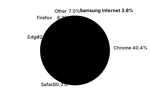
I chose option 3. When the browser identifies itself as Samsung Internet, the site adds a white border around the important controls that would otherwise fade into the background. Other browsers get exactly the same page as before.
Even then, the Samsung Browser darkens the white border to grey. 🙁 But the controls are now visible, and I count that as close enough.
| Forced dark, no fix | Forced dark, with the Samsung fix |
|---|---|
 |
 |
 |
 |
Throughout all of this, I relied on a spare Samsung phone that I happened to have. The problem only appears on a Samsung phone in dark mode, visiting the site with the Samsung Browser. Firefox, Chrome, Brave and others on the same phone are fine. The screenshot tests can approximate it, but Samsung's exact rules aren't public, so every important change had to be checked on the real device.
The website's main goal is to be easily accessible to the whole community. Its second important goal is to be easy to maintain, so that it stays active and accessible over time.
Samsung's forced dark implementation was getting in the way of the first goal. The fix moved that burden onto the second: the site now has two colour themes to maintain and a special Samsung-only workaround. This is not ideal, but I think it strikes the right balance.
— Aner Ben-Artzi, webmaster, Repair Café Zug website